Multi-column data plotting with Gnuplot
Monday, July 14th, 2014
In my previous post I showed how to generate good looking charts with Gnuplot. Those were simple bar charts with a single bar. In this post I want to show you how to plot bar charts with multiple bars. Such charts take multiple columns of data and plot them grouped in the chart. We’ll be working with the following data:
2013-4    271467    250500
2013-5    217188    198030
2013-6    192770    163000
2013-7    242761    233000
2013-8    192893    189603
2013-9    209139    154500
2013-10    235128   202300
2013-11    264841   250070
2013-12    290258   270699
2014-1    249561    209000
2014-2    225669    185000
2014-3    247809    212000
We will re-use the Gnuplot settings from the previous post. In the previous post, we used the “plot … with boxes” method of plotting bar charts. To plot a second set of data, we just add another plotting rule after the first one:
plot "registrations.dat" using 2:xticlabels(1) with boxes lt rgb "#406090",\
     "" using 3 lt rgb "#40FF00"
We don’t need to specify a data file. Gnuplot will simply reuse the first one. We define the third column and set a different color for the second set of data. This is what it produces:
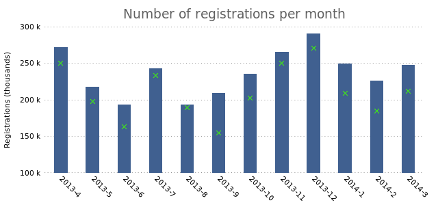
As you can see, it plots the third column of data as “X”s on top of the current bar. If we add the “with boxes” option to the second plotting rule, we’ll see that it creates overlapping bars:
plot "registrations.dat" using 2:xticlabels(1) with boxes lt rgb "#406090",\
     "" using 3 with boxes lt rgb "#40FF00"
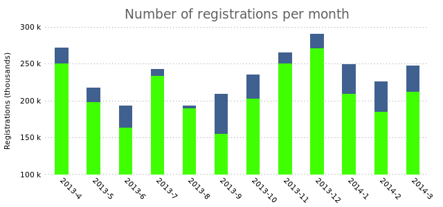
While that could be a useful way to represent your data, what if you want the bars to appear next to each other? Now we run into a problem. The plotting method we use can’t deal with that. We need to plot our data as a histogram. Let’s first see how that works with a single bar:
set boxwidth 1
set style data histograms
plot "registrations.dat" using 2:xtic(1) lt rgb "#406090"
We change the boxwidth to “1” (from 0.6 in in the previous post). We then set the plotting style to “histograms”. The rest remains the same.
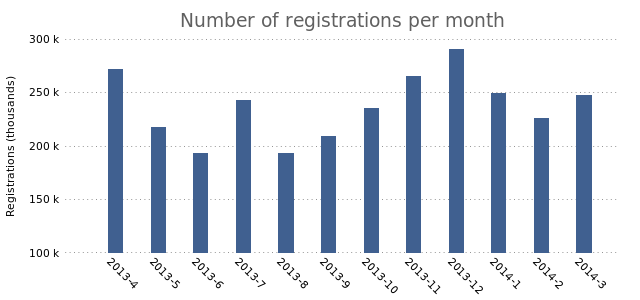
This looks a lot like the final result from the previous post. Now we’re all set to start plotting multiple bars. Let’s add a second plot:
set style data histograms
plot "registrations.dat" using 2:xtic(1) lt rgb "#406090",\
     "" using 3 lt rgb "#40FF00"
This results in the following chart:
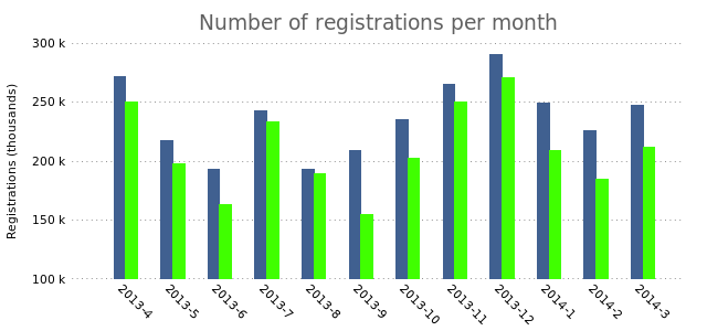
The bars slightly overlap, which we can fix by changing the box width to a slightly smaller value:
set boxwidth 0.8
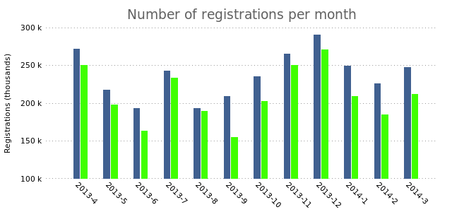
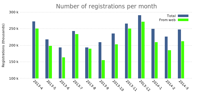
In charts with multiple columns of data it would be smart to add the legend that we removed in the previous post.
#set nokey
plot "registrations.dat" using 2:xtic(1) title "Total" lt rgb "#406090",\
     "" using 3 title "From web" lt rgb "#40FF00"
There you have it. Multiple bars. Adding even more bars is a simple as simply adding another plot.
Update: Thanks to Mario Domenech Goulart for spotting that the link to the previous GNUplot post was broken!

