
Generating good-looking charts with Gnuplot
Saturday, July 12th, 2014
Gnuplot is a tool for plotting graphs. It was originally created to allow scientists and students to visualize mathematical functions and data interactively, but has grown to support many non-interactive uses such as web scripting. It is excellent for generating all kinds of charts. Unfortunately, the defaults for Gnuplot don’t generate very appealing charts:
set terminal png size 640,300
set output "1.png"
plot "registrations.dat" using 2:xticlabels(1) with boxes lt rgb "#406090"
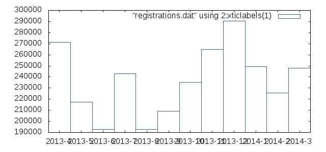
That’s uh.. pretty ugly. Maybe that looks great if you’re going for the whole sciency look, but we want something better. Let’s fix ‘r up!
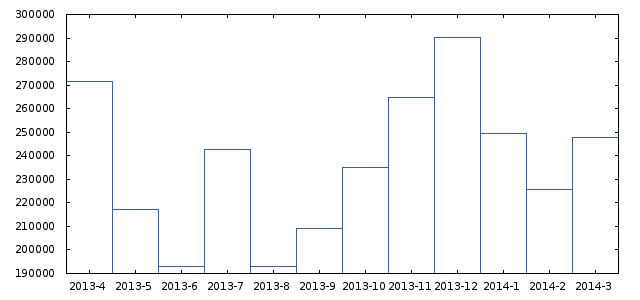
The first things we’ll do is change that ugly font to something better and get rid of the text inside the graph.
# Output to PNG, with Verdana 8pt font
set terminal png nocrop enhanced font "verdana,8" size 640,300

# Don't show the legend in the chart
set nokey
Here’s what it looks like now. Slightly better:
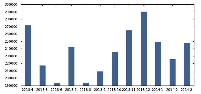
Let’s do something about those horrid bars. We’ll make them thinner and fill them in.
# Thinner, filled bars
set boxwidth 0.4
set style fill solid 1.00
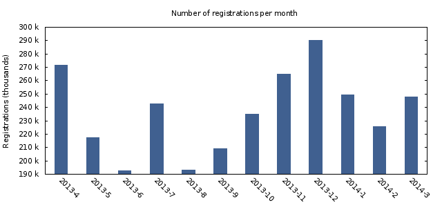
Okay. Now we’ll do something about the labels. We’ll add a title to the chart, set a label on the Y-axis and make the values on the Y-axis better readable.
# Set a title and Y label. The X label is obviously months, so we don't set it.
set title "Number of registrations per month"
set ylabel "Registrations (thousands)"

# Rotate X labels and get rid of the small striped at the top (nomirror)
set xtics nomirror rotate by -45

# Show human-readable Y-axis. E.g. "100 k" instead of 100000.
set format y '%.0s %c'
It now looks like this:
Now we’re getting somewhere! One of the rules of creating nice charts is “less is more”. This means you should remove everything that is not vital to getting your message across. See the little stripes on the Y-axis on the left and right side of the chart? Useless. Border? Useless. Let’s get rid of them:
# Replace small stripes on the Y-axis with a horizontal gridlines
set tic scale 0
set grid ytics

# Remove border around chart
unset border
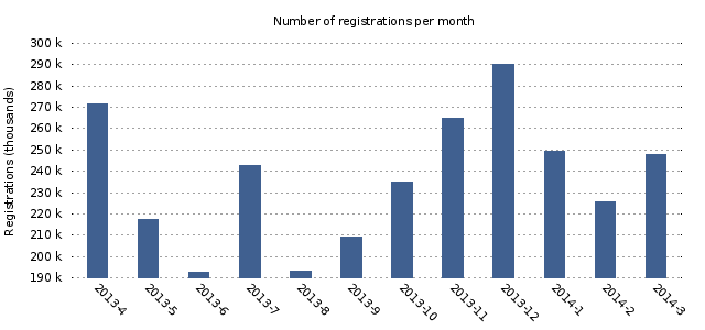
Much nicer. Let’s do a few small optimizations and we’ll be done. We increase the title’s font size and color, change the range of the Y-axis from 190k-300k to 100k-300k and make the horizontal grid lines a little less pronounced.
# Set a title and Y label. The X label is obviously months, so we don't set it.
set title "Number of registrations per month" font ",14" tc rgb "#606060"

# Lighter grid lines
set grid ytics lc rgb "#C0C0C0"

# Manual set the Y-axis range
set yrange [100000 to 300000]
The final result:
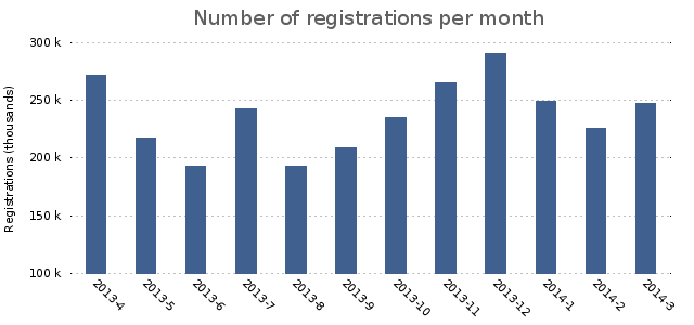
One final improvement we can make is changing the rendering engine from the default to the Cairo engine. Whether this works for you depends on if your Gnuplot was compiled with Cairo enabled. The Cairo engine does a much better job of anti-aliasing the chart, which is especially important for line charts. Here’s how to enable rendering with the Cairo engine:
set terminal pngcairo nocrop enhanced font "verdana,8" size 640,300
set grid ytics lc rgb "#505050"
We also had to modify the grid color, because it was barely distinguishable in the Cairo render. This is what it looks like:
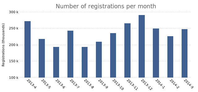
Here’s the full GnuPlot file:
# Output to PNG, with Verdana 8pt font
set terminal pngcairo nocrop enhanced font "verdana,8" size 640,300

# Don't show the legend in the chart
set nokey

# Thinner, filled bars
set boxwidth 0.4
set style fill solid 1.00

# Set a title and Y label. The X label is obviously months, so we don't set it.
set title "Number of registrations per month" font ",14" tc rgb "#606060"
set ylabel "Registrations (thousands)"

# Rotate X labels and get rid of the small stripes at the top (nomirror)
set xtics nomirror rotate by -45

# Show human-readable Y-axis. E.g. "100 k" instead of 100000.
set format y '%.0s %c'

# Replace small stripes on the Y-axis with a horizontal gridlines
set tic scale 0
set grid ytics lc rgb "#505050"

# Remove border around chart
unset border

# Manual set the Y-axis range
set yrange [100000 to 300000]

set output "6.png"
plot "registrations.dat" using 2:xticlabels(1) with boxes lt rgb "#406090"
The data used (registrations.dat):
2013-4    271467
2013-5    217188
2013-6    192770
2013-7    242761
2013-8    192893
2013-9    209139
2013-10    235128
2013-11    264841
2013-12    290258
2014-1    249561
2014-2    225669
2014-3    247809
You can save the Gnuplot directives to a file called “base.gnuplot” and include it in other files to get the desired result for multiple charts:
load "base/charts/base.gnuplot"
Gnuplot has a huge number of options and abilities. Here’s a few resources that show how Gnuplot can be used:
I hope you found this post useful.