A new Material design for Ansible-cmdb v1.5
Monday, September 21st, 2015
Ansible-cmdb takes the output of Ansible’s setup module and converts it into a static HTML overview page containing system configuration information.
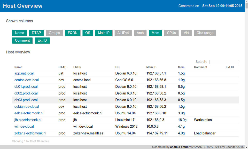
While the previous generated overview page was functional, it didn’t look very good. So for the v1.5 release (which is now available), I gave it an overhaul. I decided on Material design because it gives a modern, clean look and feel. The host overview page now looks like this:
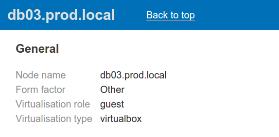
The column toggle buttons are more recognisable as actually being toggles and the table of hosts feels a lot cleaner. The bar at the top stays in view even when scrolling. When viewing a hosts detailed information, the header text changes to the host name, making it easier to recognise which host’s information you’re looking at:
The header bar also includes a link back to the top of the page. This is a big improvement over the previous design, which lacked such a feature.The new design also works better on smaller screens such as tablets or mobiles, although it could still do better.
Other than the new design, the v1.5 release also works when viewing it locally in the browser, without the need to specify the -p local_js option.
You can view a live example or download the new release from the Github releases page.
More information on ansible-cmdb can be found in the README.


