Minimalising the Gmail interface
Sunday, March 15th, 2015
Since a few months I’ve been using the Gmail web interface as my main email client. So far my experience has been pretty good, although it took some getting used to. I’m running it in a separate window instead of my main browser. For this I’m using it as an Application in Chrome (Open Gmail in Chrome and select Menu → Tools → Create Application Shortcut).
Since I’m running it in a separate window, much like a normal desktop email client, I’d like the interface to be as minimal and simple as possible. I don’t use labels; either an email is in my inbox, or it’s archived. Gmail’s search is good enough that I don’t require the use of labels.
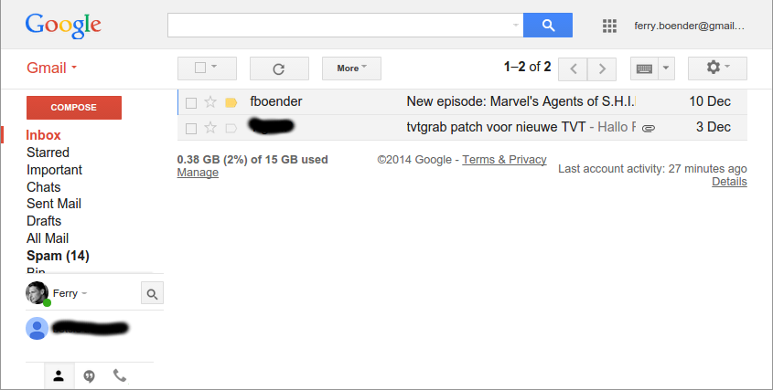
I wrote a UserStyles style to remove unneeded elements from the interface. This is what Gmail looked like before:

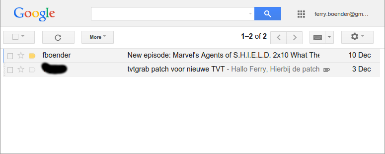
This is what it looks like with my UserStyle active:

If you’d like your gmail interface to look the same:
- Get the Stylish plugin for your browser (Firefox, Chrome)
-
Install the “Gmail minimal” UserStylle
It removes the labels sidebar, so you’ll need to use Gmail a bit differently than you’re used to if you use this style:
-
Instead of pressing the Compose button, press Shift-C. This will open a new window in which you can compose your message. (Press “?” in Gmail to view a list of all shortcuts)
-
Instead of labels, use the search box to find what you need. You can filter on sender by searching for: “from:”. You can view mail with a label by searching for “in:”. For example: “in:spam”, “in:important”, etc.
